26 stories
·
2 followers

Noch nicht genug Weltuntergang? Hier analysiert ein ...

2 Shares
Noch nicht genug Weltuntergang? Hier analysiert ein Ökonom die Auswirkungen des Coronavirus auf die Weltwirtschaft. Und zur Abwechslung befragen sie einen, der bei früheren Vorhersagen richtig lag.

Seine Einschätzung: Das ist ein Supply Shock, der wird die Welt in die Krise stürzen, die Politik reagiert viel zu langsam und die Notenbanken sind machtlos. Er glaubt, dass China einen Sündenbock brauchen wird und daher in Hong Kong, Taiwan oder gar Vietnam Ärger anfangen wird, und dass Trump seine Wiederwahl verliert, wenn das Virus die USA ernsthaft erreicht.

I expect global equities to tank by 30 to 40 percent this year. My advice is: Put your money into cash and safe government bonds, like German bunds. They have negative rates, but so what? That just means that prices will rise and rise - you can make a lot of money that way. And if I am wrong and equities go up by 10 percent instead, that’s also OK. You have to hedge your money against a crash, that is more important. That’s my motto: "Better safe than sorry!"
global equities ist der weltweite Aktienmarkt.
Read the whole story
liob
1501 days ago
reply
Share this story
Delete

Move Zotero Citations Between Google Docs, Word, and LibreOffice

2 Shares

Last year, we added Google Docs integration to Zotero, bringing to Google Docs the same powerful citation functionality — with support for over 9,000 citation styles — that Zotero offers in Word and LibreOffice.

Today we’re adding a feature that lets you move documents between Google Docs and Word or LibreOffice while preserving active Zotero citations. You can now begin writing a document collaboratively in Google Docs and move it to Word or LibreOffice for final editing, or vice versa.

When you use this feature, Zotero will convert the citations and bibliography to a temporary format that can be transferred safely between word processors.

We’ve added instructions for specific word processors, but the basic process is the same:

  1. Choose “Switch to a Different Word Processor…” from the plugin’s Document Preferences window.
  2. Save the converted file.
  3. Open the file in the other word processor.
  4. Click Refresh to continue using it.

Zotero plugin Document Preferences window

In Google Docs, you can also choose “Switch Word Processors…” from the Zotero menu.

Zotero plugin Document Preferences window

While the process should be entirely reversible, we recommend performing the conversion in a copy of the file.

While this conversion process is required to move active citations in and out of Google Docs, you can also use it to move documents between Word and LibreOffice without some of the problems inherent in Bookmarks mode.

You can start using this feature today in Zotero 5.0.72 and Zotero Connector 5.0.57.

Read the whole story
liob
1730 days ago
reply
Share this story
Delete

Burden and characteristics of unsolicited emails from medical/scientific journals, conferences, and webinars to faculty and trainees at an academic pathology department

1 Share
Matthew D Krasowski, Janna C Lawrence, Angela S Briggs, Bradley A Ford

Journal of Pathology Informatics 2019 10(1):16-16

Background: Professionals and trainees in the medical and scientific fields may receive high e-mail volumes for conferences and journals. In this report, we analyze the amount and characteristics of unsolicited e-mails for journals, conferences, and webinars received by faculty and trainees in a pathology department at an academic medical center. Methods: With informed consent, we analyzed 7 consecutive days of e-mails from faculty and trainees who voluntarily participated in the study and saved unsolicited e-mails from their institutional e-mail address (including junk e-mail folder) for medical/scientific journals, conferences, and webinars. All e-mails were examined for characteristics such as reply receipts, domain name, and spam likelihood. Journal e-mails were specifically analyzed for claims in the message body (for example, peer review, indexing in databases/resources, rapid publication) and actual inclusion in recognized journal databases/resources. Results: A total of 17 faculty (4 assistant, 4 associate, and 9 full professors) and 9 trainees (5 medical students, 2 pathology residents, and 2 pathology fellows) completed the study. A total of 755 e-mails met study criteria (417 e-mails from 328 unique journals, 244 for conferences, and 94 for webinars). Overall, 44.4% of e-mails were flagged as potential spam by the institutional default settings, and 13.8% requested reply receipts. The highest burden of e-mails in 7 days was by associate and full professors (maximum 158 or approximately 8200 per year), although some trainees and assistant professors had over 30 e-mails in 7 days (approximately 1560 per year). Common characteristics of journal e-mails were mention of “peer review” in the message body and low rates of inclusion in recognized journal databases/resources, with 76.4% not found in any of 9 journal databases/resources. The location for conferences in e-mails included 31 different countries, with the most common being the United States (33.2%), Italy (9.8%), China (4.9%), United Kingdom (4.9%), and Canada (4.5%). Conclusions: The present study in an academic pathology department shows a high burden of unsolicited e-mails for medical/scientific journals, conferences, and webinars, especially to associate and full professors. We also demonstrate that some pathology trainees and junior faculty are receiving an estimated 1500 unsolicited e-mails per year.
Read the whole story
liob
1789 days ago
reply
Share this story
Delete

The data.table Cheat Sheet

1 Share

(This article was first published on DataCamp Blog » R, and kindly contributed to R-bloggers)

The data.table package provides an enhanced version of data.frame that allows you to do blazing fast data manipulations. data.table is being used in different fields such as finance and genomics, and is especially useful for those of you that are working with large data sets (e.g. 1GB to 100GB in RAM).

Although its typical syntax structure is not hard to master, it is unlike other things you might have seen in R. Hence the reason to create this cheat sheet. DataCamp’s data.table cheat sheet is a quick reference for doing data manipulations in R with the data.table package, and is a free-for-all supplement to DataCamp’s interactive course Data Analysis the data.table Way.

The cheat sheet  will guide you from doing simple data manipulations using data.table’s basic i, j, by syntax, to chaining expressions, to using the famous set()-family. You can learn more about data.table at DataCamp.com.

The post The data.table Cheat Sheet appeared first on DataCamp Blog.

To leave a comment for the author, please follow the link and comment on his blog: DataCamp Blog » R.

R-bloggers.com offers daily e-mail updates about R news and tutorials on topics such as: visualization (ggplot2, Boxplots, maps, animation), programming (RStudio, Sweave, LaTeX, SQL, Eclipse, git, hadoop, Web Scraping) statistics (regression, PCA, time series, trading) and more...

Read the whole story
liob
3433 days ago
reply
Share this story
Delete

Standards for Scientific Graphic Presentation

1 Share

TL;DR: Over the previous hundred years, a lot of work has gone into standardizing the way scientific data is presented. All of this knowledge has been largely forgotten. I want us to bring it back to life.

Before we talk about science, let’s take a short but scenic detour. A few months ago, while scrolling through the latest popular Kickstarters (as I tend to do in an effort to get motivated to get out of bed), I came across this fantastic project: Full size reissue of the NYCTA Graphics Standards. You see, in the 1960s, taking the subway in New York was a chaotic experience.

Chaotic signs of the New York subway

Walking down the stairs of a subway entrance (once you were lucky enough to find one), you were bombarded by a cacophony of diverse signs that took quite a lot of mental effort to comprehend. Figuring out exactly which train you have to take from which platform1 on which side, was far from trivial.

Massimo Vignelli, Bob Noorda, Unimark

In the late sixties the transit authority finally hired designers Massimo Vignelli and Bob Noorda (Unimark) to organize this chaos and devise a new system for wayfinding in New York’s subway system. When the work was finished in 1970 with the publication of the Graphic Standards Manual, it not only succeeded in its initial goals, but also became a timeless example of great design elegantly solving a real problem.

As a result, all of the various styles of conveying directions and wayfinding were unified into a single iconic graphic standard that helps you effortlessly find your way around New York to this day, enabling you to focus on your journey as opposed to focusing on deciphering signs.

OK, that’s cool, but what does all this have to do with science?

Hold on, we’re getting there. A few days later I was, coincidentally, reading up on the history of information and data visualization while working on a project at PLOS visualizing article metrics in various ways, when I stumbled on this little hidden treasure:

... a set of standards and rules for graphic presentation was finally adopted by a joint committee (Joint Committee on Standards for Graphic Presentation, 1914)

Uhm, what? What standards? I have never heard of standards in graphic presentation, i.e. standards for charts and figures. What is all this about? And with this question a journey into the knowledge black hole began.

And what an exhilarating journey it was, and really, still is. Take my hand and let’s go! First, let’s find this document from 1914: http://www.jstor.org/stable/pdfplus/2965153.pdf2. Ideally, I’d like you to send this PDF to your tablet or print it out, make a cup of tea, take a deep breath, jump on the couch and just read it through. It's only 10 pages and even these are heavily illustrated.

This document was produced by a committee of several really smart people from all branches of science and engineering, people and organizations like Willard Brinton (chairman) from the American Society of Mechanical Engineers (of Graphic Presentation fame), the American Mathematical Society, the American Statistical Association, American Genetic Association, American Association for the Advancement of Science, and so on. I hope I’ve made the point that this was a very capable group people coming together for a common cause.

So what does this document contain? It begins with a great thought and rationale for standardizing scientific graphics:

If simple and convenient standards can be found and made generally known, there will be possible a more universal use of graphic methods with a consequent gain to mankind because of the greater speed and accuracy with which complex information may be
imparted and interpreted.

That's exactly what the Graphic Standards Manual achieved for the subway system, unifying how information is conveyed and thereby significantly speeding up and simplifying its use, to the point where you don’t think about how the information is presented, but instead think only about the information itself. And this is the connection between the New York transit authority’s efforts, and the efforts of the scientific community a hundred years ago. With one major, critical distinction: While the Graphics Standards Manual is still successfully being used today, the efforts of the Joint Committee on Standards for Graphic Presentation have been eroded by the sands of time and simply forgotten.

There are a lot of other pearls of wisdom to be found in this work, but there is one in particular that stood out:

If numerical data are not included in the diagram it is desirable to give the data in tabular form accompanying the diagram

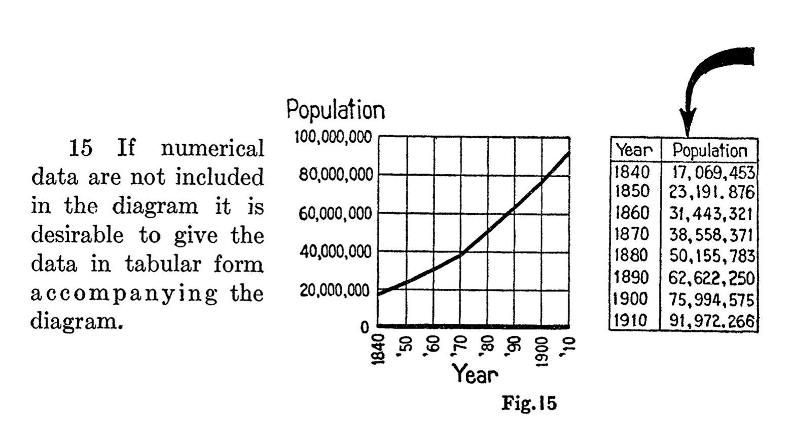
This is essentially saying that data should accompany the figure. A hundred years later, we’re still far from applying this simple but powerful rule. Projects like The Content Mine expend a tremendous amount of energy trying to get data back from figures, and even then it’s a very lossy process. All of this could be avoided if we just follow this one simple rule.

It’s clear these people know what they’re talking about and it makes sense to try and find more of their work. After a lot more digging, I found that this was not the last time this committee convened. In Calvin F. Schmid's review of "The Role of Standards in Graphic Presentation"3, it’s mentioned briefly that several more meetings were held:

Since the publication, in 1915, of the report by the original Joint Committee, other committees prepared expanded reports on the standards of graphic presentation in 1936, 1938 and 1960.

Obviously, we need to find these documents as well. This, however, is not easy. In fact, I’ve only managed to find the 1938 report4 online. Consider this also a call for help: If you have any ideas about how to locate the 1936 and 19605 documents (titled "Time-series charts"), please let me know. Additionally, upon further research I discovered there was one more publication, a final revision in 1979 of what was at that point an actual ANSI standard Y15.2M6. This document cannot be found online either, and is available only in select libraries in the States.

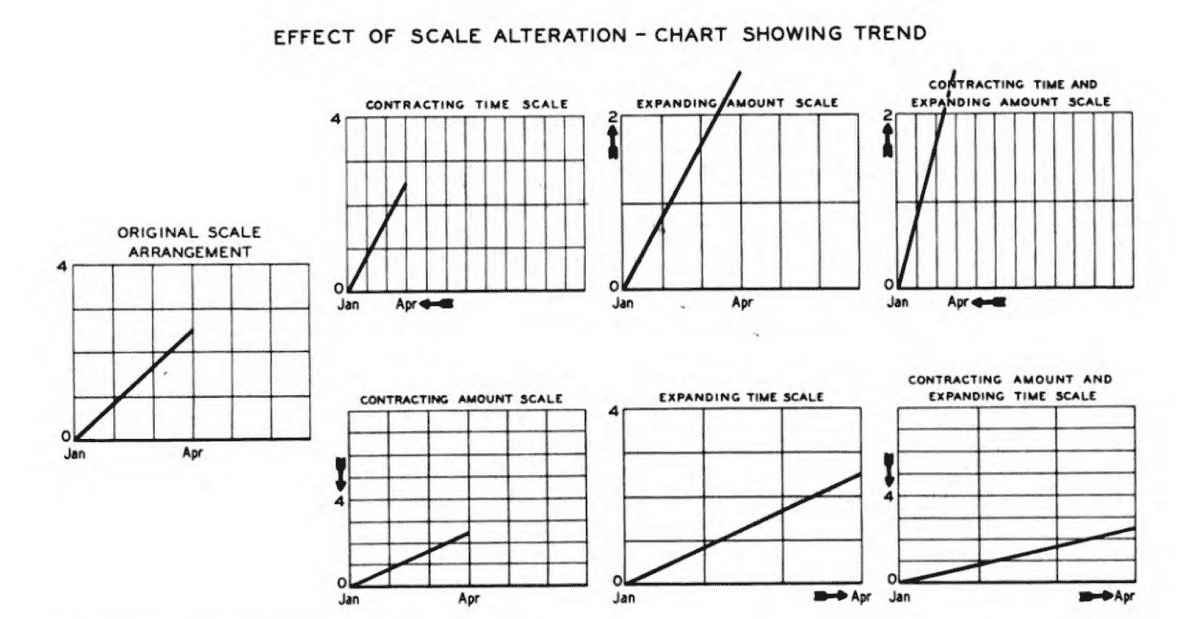
But let’s work with what we have: The 1938 revision is an incredible piece of work. It addresses everything you could possibly think of in terms of how to construct your charts. From good composition practices, such as centering a chart around an optical center, to usage of grids, inclusion of a 0 baseline to avoid perceptual distortion, the importance of scale selection, labeling of axes and curves, reference notes, line styles, and so much more. We should try and use this knowledge to improve the presentation of scientific data today.

Like the New York subway system in early 1960s, scientific figures are currently in a very chaotic state There are significant differences in presentation of the same types of data, which undoubtedly results in a loss of efficiency when researchers are interpreting this information.

On top of that, some other common issues are7:

  1. There are too many lines packed on a single line chart.
  2. The charts are needlessly ornamented with things like gradients or 3D effects.
  3. The axis is missing or constructed in a non-intuitive way, or the baseline is missing.
  4. The data is not included in the figure.
  5. An improper chart type is selected.

All of these issues have been addressed in significant detail in the documents mentioned and while a lot of best practices have been established organically, there is simply no excuse for forgetting the vast knowledge that was painstakingly created so many years ago. On top of that, while it was possibly a bigger effort to follow these standards a hundred years ago, when each figure was drawn by hand, it is technically possible to follow these standards with a single click today. In fact, with the technical capabilities we have, it's unforgivable that we still allow figures to be flattened and mushed together into compressed images when they are prepared for publication. But I digress.

Show ... me ... the example!

I had a difficult time finding a figure which would be easy to rebuild using modern technology, purely because the data necessary to recreate figures is almost never available. One bright example which does include data is, not surprisingly, Heather Piwowar's paper on the open data citation advantage. Following some standards found in the documents and using some modern tools, I decided to rebuild Figure 2 of that paper:

This is an interactive figure, which also has data included. If you click on the data link, you will automatically download the data that is presented, in a JSON format.

This is of course a simple example, but there are MANY such simple charts in scientific papers and it is not a significant effort to recreate them following a century old standards.

What can we do next?

As a first step, we should bring this knowledge back to life. Find copies of the reports and digitize them, upload them to archive.org so that they may never disappear again.

Second, given the breadth of the material found and of the material remaining to be found, it will take some time to study all of it. If you are interested in helping with that, drop me a note. The creation of these standards was a community effort and such should be their modernization. Things like interactivity and modern ways to include data should be discussed as well.

Third, the problem of the way we create scientific charts and figures should simply be recognized. The mistakes of flattening each figure and compressing it, mangling the data, converting vector illustrations into raster images - all of those should be recognized and addressed. Only be recognizing that this is actually a problem, and acknowledging that we do have the means to fix this problem, will we be able to progress.

Fourth, we should connect efforts such as http://metricsgraphicsjs.org, http://idl.cs.washington.edu/projects/lyra/, Datawrapper and so many more. Modernizing scientific data presentation is our common goal.

Conclusion

Sometimes it makes sense to listen to the old masters. The issue of graphic presentation is certainly one where we’ve ignored their efforts and we should try and correct that.

It starts with you.

Notes

  1. I did not actually ride the subway in the 1960s, but would be happy to learn what the experience was like from anyone who did.
  2. Joint Committee on Standards for Graphic Presentation. Publications of the American Statistical Association, Vol. 14, No. 112 (Dec., 1915), pp. 790-797. Published by: Taylor & Francis, Ltd. on behalf of the American Statistical Association. Article DOI: 10.2307/2965153. Article Stable URL: http://www.jstor.org/stable/2965153
  3. Graphic Presentation of Statistical Information: Papers Presented at the 136th Annual Meeting of the American Statistical Association, Social Statistics Section : Session of Graphical Methods for Presenting Statistical Data : Boston, Massachusetts, August 23-26, 1976
  4. American Society of Mechanical Engineers. (1938). Time series charts: a manual of design and construction. American standard. Approved by American standards association, November 1938. New York: Committee on Standard for Graphic Presentation, American Society of Mechanical Engineers.
  5. American Standards Association., & American Society of Mechanical Engineers. (1960). Time-series charts. New York: American Society of Mechanical Engineers.
  6. American National Standards Institute., & American Society of Mechanical Engineers. (1979). Americal national standard: Time-series charts. New York: American Society of Mechanical Engineers.
  7. I’ve made the examples black and white, to further emphasize some of the accessibility issues
Read the whole story
liob
3439 days ago
reply
Share this story
Delete

Das BSI hat einen Praxis-Leitfaden für Penetrationstests ...

1 Share
Das BSI hat einen Praxis-Leitfaden für Penetrationstests herausgegeben. Ich bin kein Freund von BSI-Bashing und blogge auch selten über Berufliches, aber dieser Leitfaden verdient Aufmerksamkeit. Zum Kontext: Das BSI ist bisher nicht durch eigene Penetrationstest-Kompetenz aufgefallen, hat keine weiterbringenden Advisories veröffentlicht, keine neuen Bugs gefunden, outsourced Dinge dafür gerne an Drittfirmen.

Die Kern-Forderung des Dokumentes ist, dass man nicht einfach bei irgendwelchen Krautern seine Penetrationstests in Auftrag geben soll, sondern bei zertifizierten Prüfstellen. Nun gibt es bisher keine zertifizierten Prüfstellen, weil völlig unklar ist, wer da überhaupt die Kompetenz haben soll, andere Marktteilnehmer zu zertifizieren. Es gibt natürlich Common Criteria und ISO9000, aber das ist hier mit Zertifizierung nicht gemeint.

Ich für meinen Teil sehe das Problem auch, dass es unseriöse Marktteilnehmer gibt, aber das wird man mit Zertifikaten nicht los. Im Gegenteil, die verkaufen selber üblicherweise Zertifikate. Ich würde sogar soweit gehen, dass man unseriöse Marktteilnehmer relativ zuverlässig daran erkennen kann, dass sie Zertifikate verkaufen.

Hier ist, was das BSI vorschlägt (Sektion 2.2.3).

Anbieter, die IS-Penetrationstests anbieten, sollten möglichst als Prüfstelle zertifiziert sein. Sie sollten nachweislich die Grundsätze des Datenschutzes, der sicheren Datenhaltung und der IT-Sicherheit einhalten und qualifiziertes Personal beschäftigen.
Das ist in der Praxis natürlich Blödsinn. Einhaltung des Datenschutzes weist man nicht nach, wie soll das auch vor dem Einsatz für die Zukunft gehen, sondern man macht einen Vertrag, wo das mit heftigen Strafen belegt wird. Und dann leakt da auch nichts. Bei der sicheren Datenhaltung kann man jetzt natürlich sagen, dass das wie eine gute Idee klingt. Aber in der Praxis steht im Vertrag drin: ihr dürft unseren Quellcode sehen, aber nicht kopieren. Es gibt da keine Daten, die man als Pentester halten würde. Außer natürlich dem Report, den man im Rahmen des Auftrags schreibt. Man archiviert da nicht jahrelang irgendwelche Daten von irgendwelchen Kunden, die bei irgendwelchen Tests vor 10 Jahren angefallen sind. Das tut man in den Vertrag und fertig.

Das mit dem qualifizierten Personal halte ich für am gefährlichsten an der ganzen Chose. Denn da gibt es schlicht keine Metriken. Es gibt natürlich irgendwelche Gruppierungen aus dem Zertifikate-Verkloppen-Umfeld, die auch Zertifikate für Personen verkloppen. Und bestürzenderweise zitiert das BSI auch genau diese Leute in ihren Referenzen am Ende, irgendwelche sinnlosen "ethical hacker"-Pömpel mit genau Null Aussagekraft. Selbst wenn jemand sein Leben lang ehrlich war, kann der ja trotzdem morgen kriminell werden und mit deinen Daten weglaufen. Die Aussagefähigkeit und Messbarkeit ist hier meines Erachtens nicht gegeben. Und insbesondere haftet keiner dieser Zertifikatsherausgeber dafür, wenn einer ihrer Zertifikatsträger sich dann anders als zertifiziert verhält. Zertifikate verkaufen ist ein Geschäftsmodell, kein Kundendienst.

Und so stellt sich auch für das BSI die Frage, was man denn jetzt machen soll, wenn keine Zertifikate vorliegen. Antwort:

Es wird dort verlangt, dass ein IS-Penetrationstester Berufserfahrung in dem Bereich IT-Penetrationstest besitzt und eine technische Ausbildung abgeschlossen hat. Der Projektverantwortliche muss in den letzten acht Jahren mindestens fünf Jahre Berufserfahrung (Vollzeit) im Bereich IT erworben haben, davon sollten mindestens zwei Jahre (Vollzeit) im Bereich Informationssicherheit absolviert worden sein. Zudem sollte der IS-Penetrationstester an mindestens sechs Penetrationstests in den letzten drei Jahren teilgenommen haben. Dies sollte möglichst vom Anbieter über entsprechende Referenzen nachgewiesen werden.
Aus meiner Sicht ist das wildes Hand Waving. Gestikulieren, damit keiner merkt, dass der Kaiser keine Kleider trägt.

In der Praxis kann man das mit den Referenzen vergessen. Viele Kunden wollen nicht als Referenz auftreten. Und selbst wenn Firma XY mit Mitarbeiter A und B einen Pentest bei Firma Z durchgeführt hat, weiß Z doch gar nicht, wer da tatsächlich die Arbeit gemacht hat. Das ist schlicht nicht bewertbar, ob A oder B fit ist. Oder beide. Oder vielleicht keiner von ihnen und sie hatten nur Glück oder ein gutes Tool dabei.

Der Report fällt dann noch durch Vorschläge wie den hier auf (Sektion 3.1.2):

Der Auftraggeber sollte gewährleisten, dass keine Änderungen an den Systemen während der Tests durchgeführt werden. Sollte der Ansprechpartner des Auftraggebers durch Beobachten des IS-Penetrationstests oder Gespräche auf Sicherheitslücken aufmerksam werden, so muss er warten, bis der IS-Penetrationstest abgeschlossen ist, bevor er die Lücke beseitigt, da sonst die Testergebnisse verfälscht werden können.
Bitte was? Der Kunde darf seine Systeme nicht sicherer machen, weil sonst der Test verfälscht werden könnte? Liebes BSI, Ziel eines Pentests ist, dass die Systeme sicherer werden, nicht dass der Test nicht verfälscht wird. Was ist DAS denn für ein Blödsinn?! Und im Übrigen, ich als Pentest-Durchführer bin der Auftragnehmer, ich kann da meinem Auftraggeber keine Vorschriften machen, wie ein Test ordentlich durchgeführt gehört.
Sollte eine derart gravierende Lücke entdeckt werden, dass es unabdingbar ist, diese sofort zu schließen, so sollte der IS-Penetrationstest abgebrochen und zu einem späteren Zeitpunkt weiter durchgeführt werden.
Es gibt keine fachliche Grundlage für diese Empfehlung.

Humoristisch besonders wertvoll ist auch diese Empfehlung (Sektion 4.1.2):

Das BSI empfiehlt, das IS-Penetrationstester nur solche Exploits einsetzen, deren Wirkungsweise sie schon untersucht und getestet haben.
Scheiße, Bernd!! Hätte mir das doch mal vorher jemand gesagt!1!!

Kurz gesagt: Das ist ein Schuss in den Ofen. Ich verstehe, dass das BSI hier gerne aktiv werden würde, denn Zertifikate kosten Geld, womöglich kann das BSI sich hier ähnlich wie das Patentamt zu einem Profit Center entwickeln. Aber den Kunden hilft das nichts. Aus meiner Sicht sind die Empfehlungen alle gesunder Menschenverstand, angereichert mit "kauft uns doch ein paar Zertifikate ab, Zertifikate können wir gut!"

Read the whole story
liob
3439 days ago
reply
Share this story
Delete
Next Page of Stories